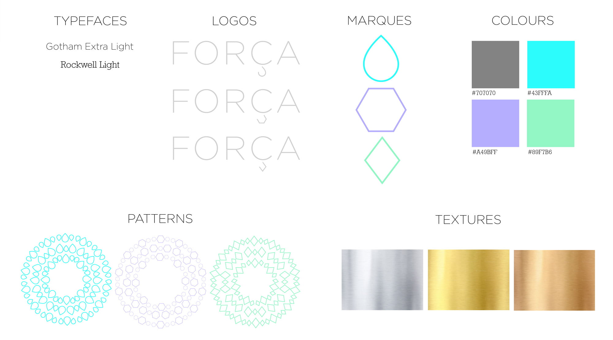
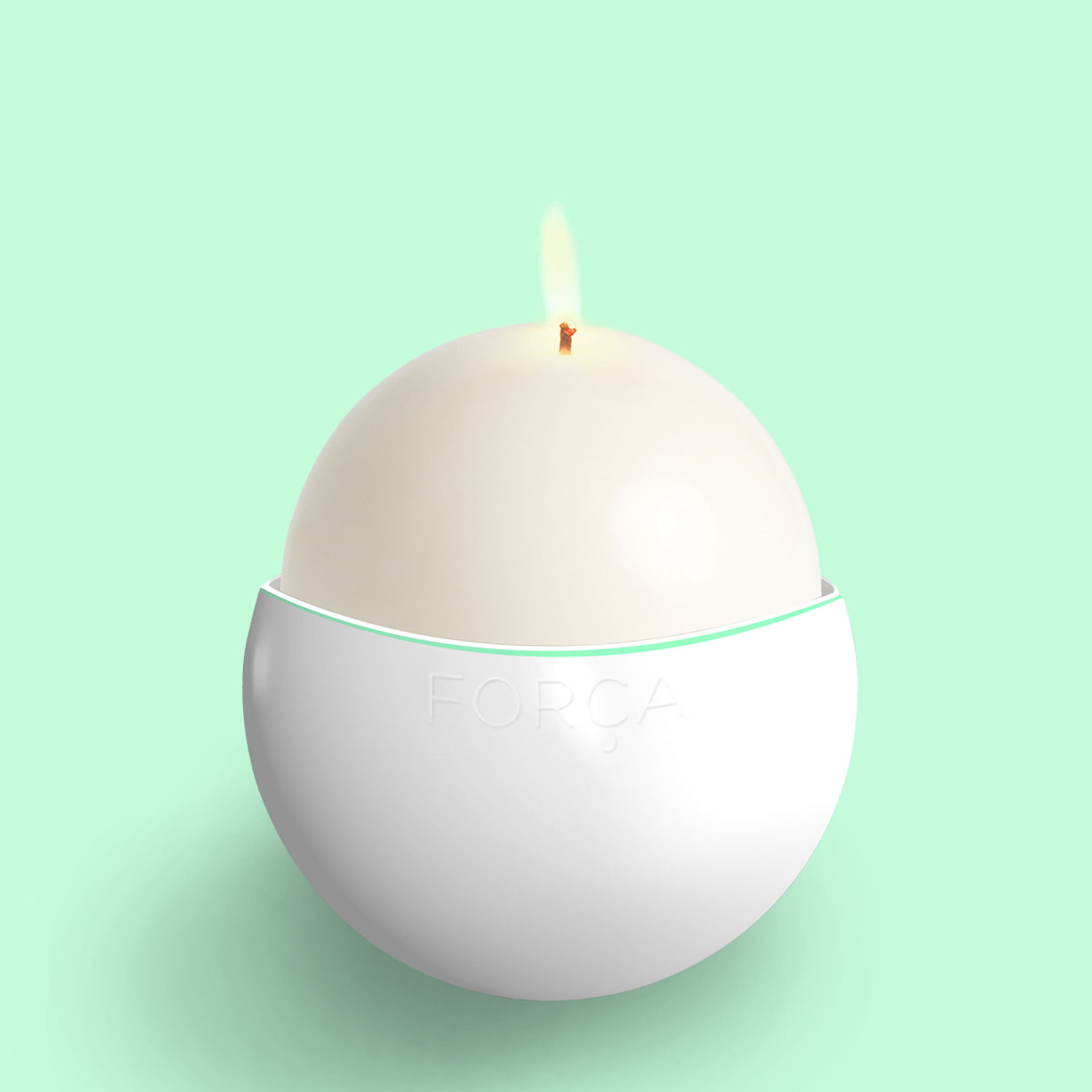
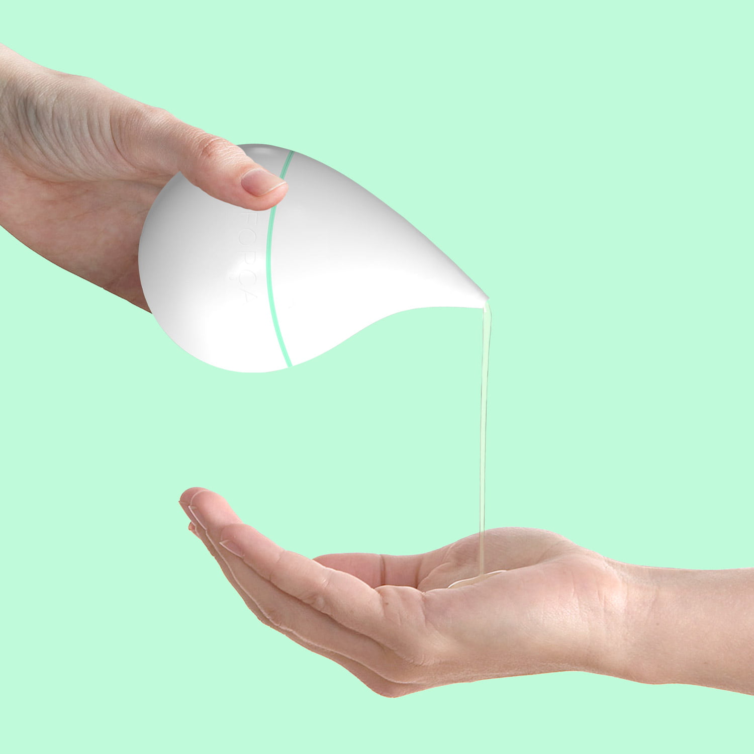
page-header

Força

Creating a visual identity for a new fragrance
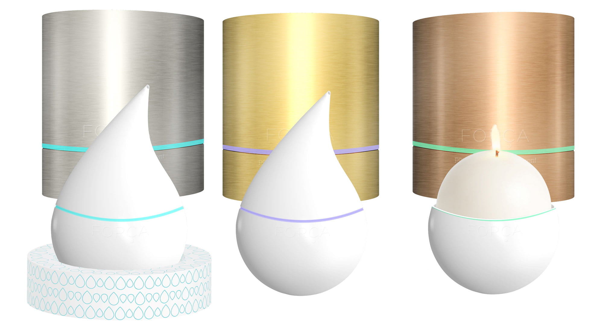
The Brief

Collaboration with Fashion Communication students, to brand and package a new fragrance product called Força.

The Concept

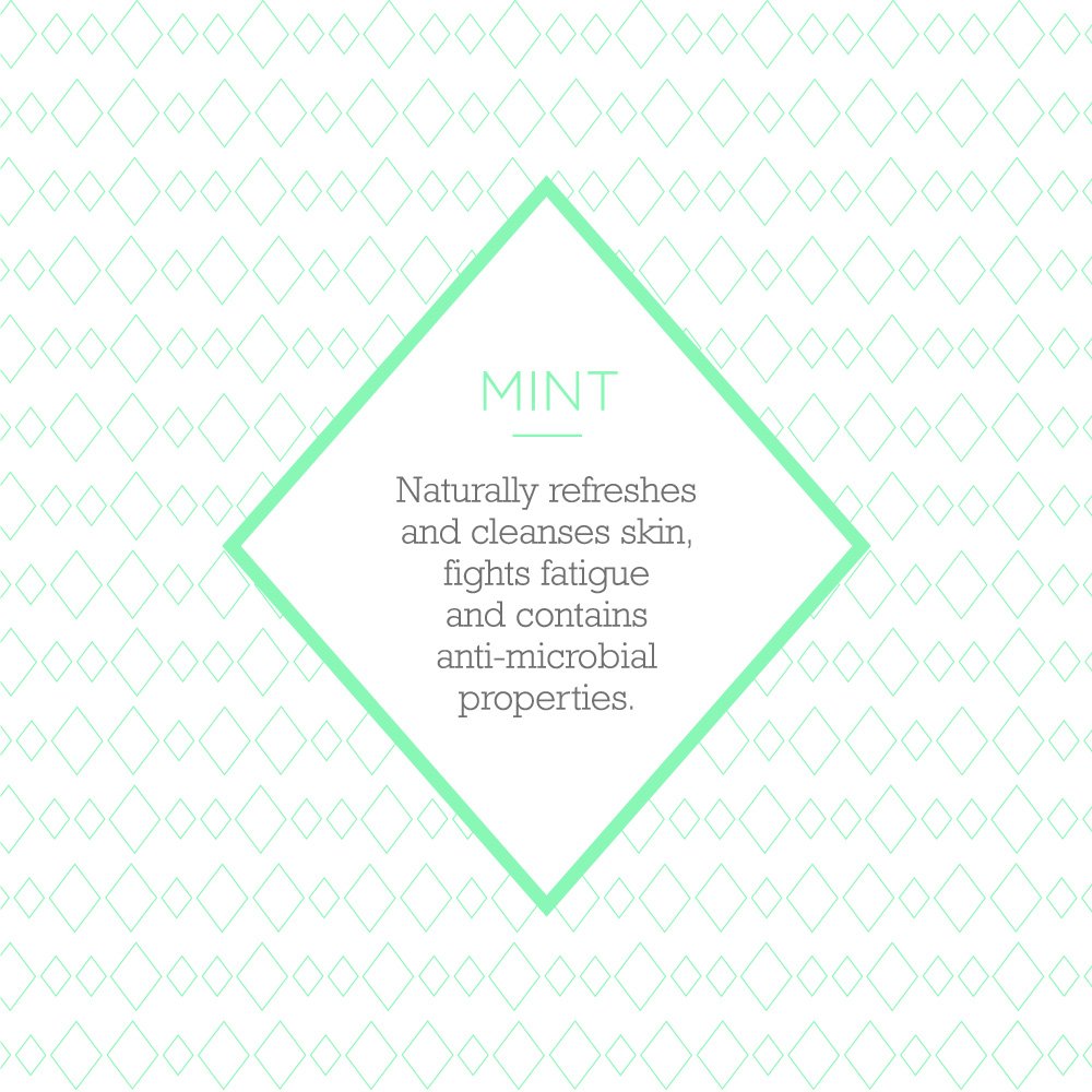
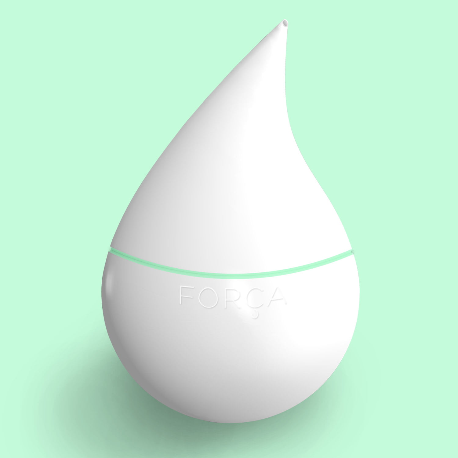
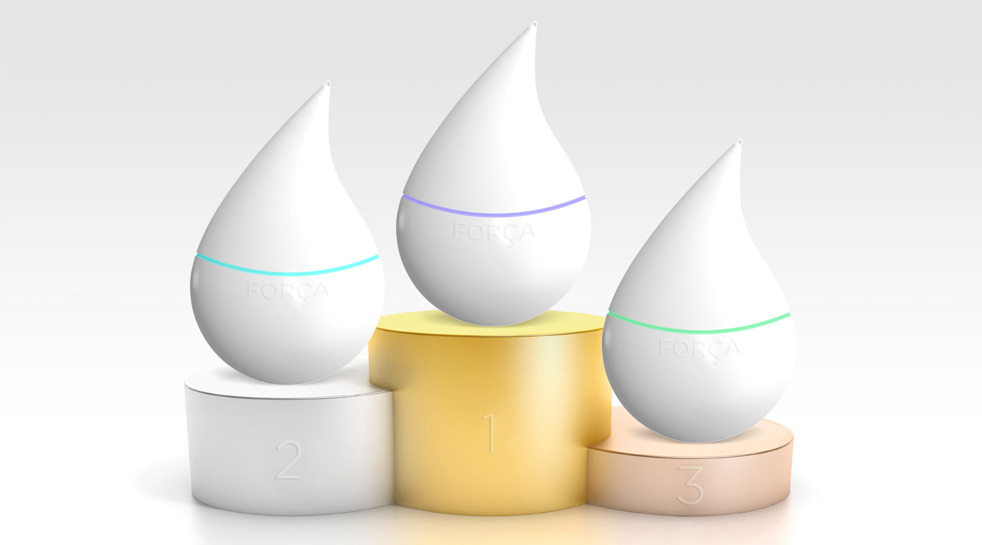
Força means “strong” in Portuguese. The brand produces massage candles sourced with all natural ingredients which melt into massaging oil, aiding recovery, relaxation and recuperation after a workout.

The Solution

The product and packaging is minimal in design to reflect the honesty of the natural ingredients in the product. It combines ergonomic and functional design into one.

Chloe Morris
Chloe Morris
The packaging is a cylindrical tin made out of brushed metal in gold, silver and bronze, referencing the Olympic medals. The product lines are identified by the colour of packaging and the pastel neon stripe circling around it. The pastel neon colour is the current trend in sportswear, suggesting the idea of vigour and power
Chloe Morris
Chloe Morris
Chloe Morris
Chloe Morris
The ceramic candle casing is shaped like a droplet, reminiscent of the melted liquid inside and allowing for easy pouring.
Chloe Morris
The lid opens from the band of colour to reveal the candle. When the candle melts, its oil is collected through a mesh at the bottom.
Chloe Morris
Once the lid is placed back on, the oil can then be poured from the spout at the top of the lid onto the skin.
Chloe Morris
The launch of the brand is centred around the Rio 2016 Olympics.
Chloe Morris
The launch will attract women with an active lifestyle to seek self-improvement and enhance well-being, as well as promote it as a premium global brand.
Chloe Morris